Session 2
Three different design from ISB, why they are effective and what info they are putting across? – Information is Beautiful
This info graphics although on a morbid subject was one i found to be very inspiring and influential, the colour scheme was something i found particularly interesting. The main thing though was the way the info was broken down, on paper this would an awful amount of text graphs and collated information, however the way the designer has separated the information into circles with smaller ones leading off, creates a really simple but highly effective way of showcasing the needed data.
This info graphic was one i found incredibly interesting, the that i found most enjoyable about it was the way the designer had created such a simplistic (might not look it, but it is) info graphic out of some very confusing in depth information. The very clean cut lines that represent the time line work fantastic against the background, and are easy to navigate as the lines are either a different style or colour depending what they are representing.

Break down of what species can catch and who carries certain
types of flu viruses. This info Graphic works well because the use of overlaying
circles with different levels of transparency, easily allows the reader to see
which species can catch and carry the specified viruses.
Notes
Information diagrams
Graphs, Glance Boxes, Maps, Diagrams and sequences.
Graphs, statistical data relationships
between different types of data.
Joseph Minard - 2
colours in 1869
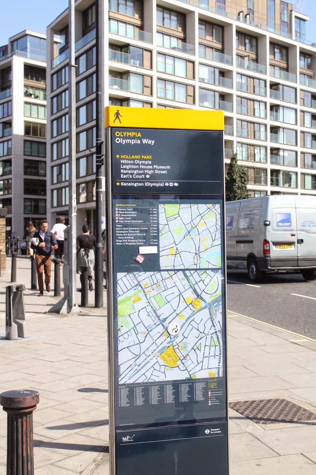
Maps
A lot of colour used to show different levels and routes,
different style of line to show e.g. rivers, roads foot paths etc.
Contour lines to show height and depth.
Audience for maps is usually adults very rarely
children.
This info graphic from film inception is very inspirational to me because i think the design is fantastic. The black background with the bright vivd colours on top works brilliantly, and creates a very clear easy to study design.